
Dark Mode vs. Light Mode: Which One is Better for Your Website?
The choice between dark mode and light mode has become a key UI/UX design decision for websites and applications. While light themes have been the default for decades, dark themes have gained popularity due to their modern look, reduced eye strain, and power efficiency on OLED screens.
So, which one is better for your website? Should you stick with a bright and clean light mode, or embrace the sleek and modern dark mode?
In this guide, we’ll compare dark vs. light mode, explore their impact on usability, accessibility, and performance, and discuss when to use each.
1. What is Dark Mode vs. Light Mode?
Light Mode (Traditional UI)
✔ Bright background (white/light gray) with dark text.
✔ Classic and widely used for readability.
✔ Common in business, blogs, and eCommerce sites.
Dark Mode (Modern UI)
✔ Dark background (black/dark gray) with light text.
✔ Popular in modern apps, coding interfaces, and gaming.
✔ Reduces glare and improves aesthetics.
Example:
- Google Search, Facebook, and Amazon default to light mode.
- YouTube, Twitter, and Discord offer a dark mode option.
2. Pros & Cons of Dark Mode vs. Light Mode
| Feature | Light Mode | Dark Mode |
|---|---|---|
| Readability | High in well-lit environments | High in low-light conditions |
| Eye Strain | Can cause fatigue in low-light settings | Easier on the eyes at night |
| Battery Efficiency | Higher battery drain on OLED screens | Saves power on OLED displays |
| Accessibility | Better for users with astigmatism | Preferred for visual focus & coding |
| Branding & Perception | Traditional, professional | Modern, stylish, futuristic |
Verdict:
- Light mode is better for general readability & traditional branding.
- Dark mode is better for nighttime use, coding, and power efficiency.
3. Impact on User Experience & Accessibility
✅ Readability & Eye Strain
Light mode: Best for long-form reading (blogs, articles).
Dark mode: Easier on the eyes in low-light environments.
Tip: Avoid pure black backgrounds (#000000)—use dark gray (#121212) for better contrast.
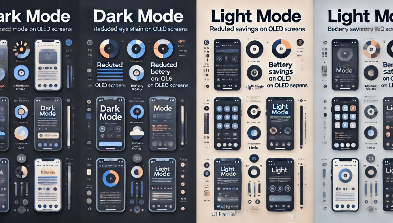
✅ Battery Consumption (OLED & AMOLED Screens)
- Dark mode saves battery on OLED screens because black pixels are turned off.
- Light mode uses more power, especially on mobile devices.
Example: Studies show dark mode reduces battery usage by 30%-50% on OLED screens.
✅ Accessibility Considerations
- Users with astigmatism may struggle with dark mode.
- High contrast in both modes is crucial for better readability.
Best Practice: Use contrast ratios recommended by WCAG (Web Content Accessibility Guidelines).
4. When to Use Dark Mode vs. Light Mode
Choose Light Mode If:
✔ Your website is content-heavy (blogs, news, eCommerce).
✔ Your audience prefers traditional UI (business, finance, healthcare).
✔ You want to ensure maximum readability in all conditions.
Best for: Corporate websites, blogs, educational platforms.
Choose Dark Mode If:
✔ Your site is used mostly at night (streaming, gaming, coding).
✔ You want a modern, futuristic look.
✔ Your audience includes developers, designers, and gamers.
Best for: Tech sites, apps, dashboards, entertainment platforms.
5. Best Practices for Implementing Dark & Light Mode
✅ Offer a Toggle Switch
✔ Let users switch between light & dark mode.
✔ Save preferences using local storage or cookies.
Example:
					const toggleSwitch = document.querySelector("#dark-mode-toggle");
toggleSwitch.addEventListener("click", () => {
  document.body.classList.toggle("dark-mode");
});
✅ Use Adaptive Colors
✔ Ensure contrast is high enough for readability.
✔ Avoid pure black backgrounds—use dark grays instead.
✅ Test for Accessibility
✔ Use tools like Google Lighthouse and WCAG contrast checkers.
✔ Ensure links, buttons, and text are clearly visible in both modes.
6. Final Thoughts: Which One Should You Choose?
Best Approach: Give users both options!
- Default to light mode (traditional & widely accepted).
- Provide a dark mode toggle for modern UI preferences.
- Ensure accessibility with high contrast ratios.
Want to improve your website’s UX? Implement both modes and let users decide!