
Typography in Web Design: How Fonts Influence User Experience
Typography is more than just choosing fonts—it plays a crucial role in branding, readability, accessibility, and user engagement. The right typography enhances readability and usability, while poor font choices frustrate users and increase bounce rates.
From serif vs. sans-serif fonts to line spacing, hierarchy, and contrast, every detail in typography affects how users perceive and interact with your website.
✅ In this guide, we’ll cover:
- Why Typography Matters in Web Design
- Best Practices for Choosing Web Fonts
- Typography and Readability: How to Optimize UX
- The Role of Fonts in Branding & Engagement
Let’s dive into how typography shapes user experience!
Why Typography Matters in Web Design
Typography influences:
✔️ First Impressions – Fonts shape brand perception within seconds.
✔️ Readability – Good typography reduces eye strain and keeps users engaged.
✔️ Conversion Rates – Legible fonts improve call-to-action (CTA) effectiveness.
✔️ Accessibility – Proper font selection ensures inclusive web experiences.
Example: A study by Google found that readable typography increases user retention by up to 40%.
Best Practices for Choosing Web Fonts
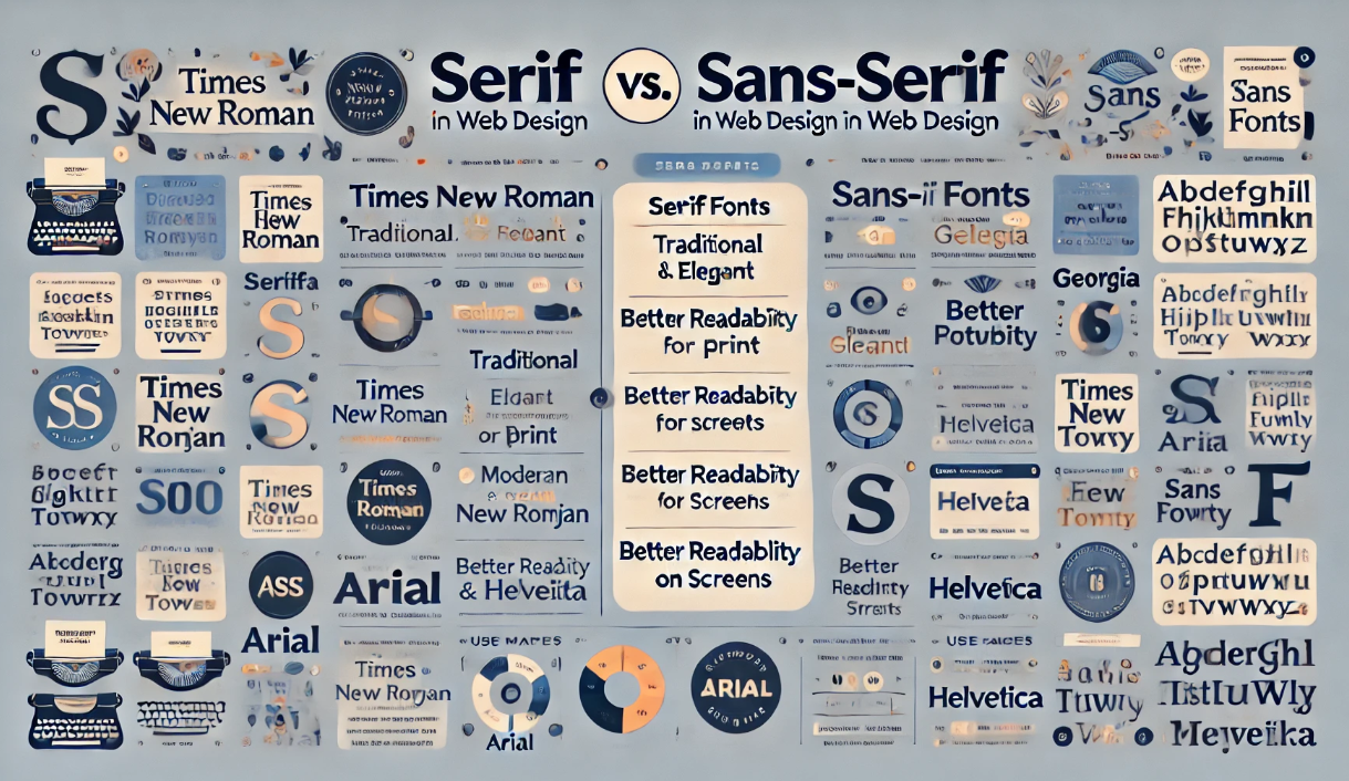
✅ 1. Serif vs. Sans-Serif: Which One to Use?
✔️ Serif Fonts (e.g., Times New Roman, Georgia) – Best for traditional, authoritative brands.
✔️ Sans-Serif Fonts (e.g., Arial, Roboto, Open Sans) – Best for modern, clean interfaces.
Example: Financial institutions prefer serif fonts for credibility, while tech startups use sans-serif fonts for a clean, futuristic look.
✅ 2. Use Web-Safe Fonts for Faster Loading
✔️ Google Fonts & System Fonts improve performance & compatibility.
✔️ Avoid excessive font families—stick to 2-3 fonts max per website.
Example: Montserrat + Lora create a modern yet elegant font pairing.
✅ 3. Optimize Line Spacing & Letter Spacing (Kerning & Leading)
✔️ Ideal line height: 1.5x the font size for better readability.
✔️ Letter spacing (kerning): Prevents text from looking too tight or too loose.
Example: Google’s Material Design recommends line spacing of 150% for body text.
✅ 4. Font Size Hierarchy for Better UX
✔️ H1 (Main Titles): 32px – 48px
✔️ H2 – H3 (Subtitles): 24px – 32px
✔️ Body Text: 16px – 20px (Ideal for readability)
Example: Apple’s website uses large headings + readable body text to guide users naturally.
Typography and Readability: How to Optimize UX
✅ 5. High Contrast Between Text & Background
✔️ Dark text on a light background is easiest to read.
✔️ Avoid low-contrast color schemes (e.g., light gray text on white).
Example: The Web Content Accessibility Guidelines (WCAG) recommend a 4.5:1 contrast ratio for body text.
✅ 6. Limit Line Length (Optimal Reading Width)
✔️ Ideal line length: 50-75 characters per line for easy scanning.
✔️ Too wide = Hard to follow text. Too narrow = Disrupts reading flow.
Example: Medium.com uses an optimal text width to enhance reading experience.
✅ 7. Responsive Typography for Mobile & Desktop
✔️ Use relative font sizes (rem, em) instead of fixed pixels.
✔️ Implement fluid typography to adapt fonts across different screen sizes.
Example: CSS media queries dynamically adjust font sizes for mobile users.
					h1 {
  font-size: 3rem; /* Adjusts dynamically based on screen width */
}
The Role of Fonts in Branding & Engagement
✅ 8. Choosing Fonts That Reflect Brand Identity
✔️ Luxury brands → Serif fonts (e.g., Playfair Display, Baskerville)
✔️ Tech & startups → Sans-serif fonts (e.g., Inter, Roboto)
✔️ Creative & modern brands → Display fonts (e.g., Poppins, Bebas Neue)
Example: Nike uses bold sans-serif fonts to convey power & modernity.
✅ 9. Font Psychology & Emotion in Web Design
✔️ Rounded fonts feel friendly & approachable.
✔️ Thin fonts feel elegant & sophisticated.
✔️ Bold fonts feel strong & confident.
Example: Coca-Cola’s script font evokes nostalgia & tradition.
✅ 10. Custom Fonts vs. Standard Fonts: What’s Best?
✔️ Custom fonts (e.g., Airbnb Cereal, Spotify Circular) create unique brand identity.
✔️ Standard fonts (Google Fonts, System Fonts) ensure faster page loading.
Example: Airbnb’s custom typeface improves brand consistency across platforms.
Final Thoughts: How to Master Typography in Web Design
✅ Key Takeaways:
✔️ Choose fonts that enhance readability & user experience.
✔️ Use proper font hierarchy & spacing to guide users.
✔️ Ensure high contrast for accessibility.
✔️ Responsive typography is essential for mobile-friendly websites.
✔️ Fonts influence brand perception & emotional response.
By mastering typography, you can create web experiences that are visually appealing, readable, and engaging!