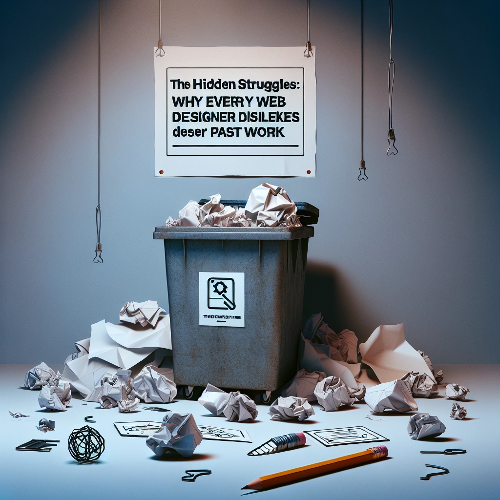
Every web designer knows the feeling of embarrassment when revisiting old projects. What once felt like a remarkable achievement can turn into a cringe-worthy reminder of bad design choices, such as awkward typography and poor user experience. This familiar scenario is not just a personal trial; it’s a universal truth among designers. The very act of recognizing how much our skills have evolved is a sign of growth.
If you’ve been designing websites for over a year, you’ve probably experienced the sinking realization that your past work is, quite frankly, embarrassing. It’s akin to browsing through old social media posts from your teen years—filled with questionable decisions and dramatic revelations. Back then, you may have felt like an innovator; now, you find yourself shaking your head and wondering why no one stepped in to intervene.
The cycle of shame is something every designer undergoes. You may eagerly revisit an old project only to be hit with a wave of horror—clashing colors, excessive use of shadows, and a button design that resembles a dated trend. You might ask yourself, "Did I actually think this was good?" Yes, at the time, you did. That’s part of the problem.
There was a moment when you believed that your latest design was nothing short of genius, complete with flawless typography and an inspired color scheme. You told yourself it was a timeless creation, one that would never haunt you in the future. Spoiler alert: it absolutely will.
Clients may still adore that design, and your family might think it’s a triumph. But deep down, you recognize the truth: it’s a ticking time bomb of embarrassment.
Many elements of past designs can make them unbearable to revisit, including:
- Overuse of Shadows and Glows: Why did everything need to look like it was floating?
- Excessive Hover Effects: The phase where everything must move was indeed cringe-worthy.
- Inexplicable Font Choices: Was "Lobster" really a good idea?
- Creative Navigation: Click the hidden options that require a treasure map to find? Clearly, usability wasn’t a priority.
- SEO Disasters: Hiding text in white on white? A real stroke of genius!
However, here’s the silver lining: if you hate your past work, it indicates your growth as a designer. If you look back on your previous projects without a hint of shame, you might be a time-traveling prodigy—or not improving at all.
Progress in web design often involves looking back, groaning in disbelief, and pushing yourself to do better next time. So, embrace this rite of passage. Laugh at the mistakes you made, learn from them, and remember that today’s design triumph may very well be tomorrow’s embarrassment.
Welcome to DediRock, your trusted partner in high-performance hosting solutions. At DediRock, we specialize in providing dedicated servers, VPS hosting, and cloud services tailored to meet the unique needs of businesses and individuals alike. Our mission is to deliver reliable, scalable, and secure hosting solutions that empower our clients to achieve their digital goals. With a commitment to exceptional customer support, cutting-edge technology, and robust infrastructure, DediRock stands out as a leader in the hosting industry. Join us and experience the difference that dedicated service and unwavering reliability can make for your online presence. Launch our website.

