
How to Design a High-Converting Website: Best Practices for UX/UI
Want to turn website visitors into customers? A well-designed User Experience (UX) and User Interface (UI) can dramatically boost engagement, conversions, and sales.
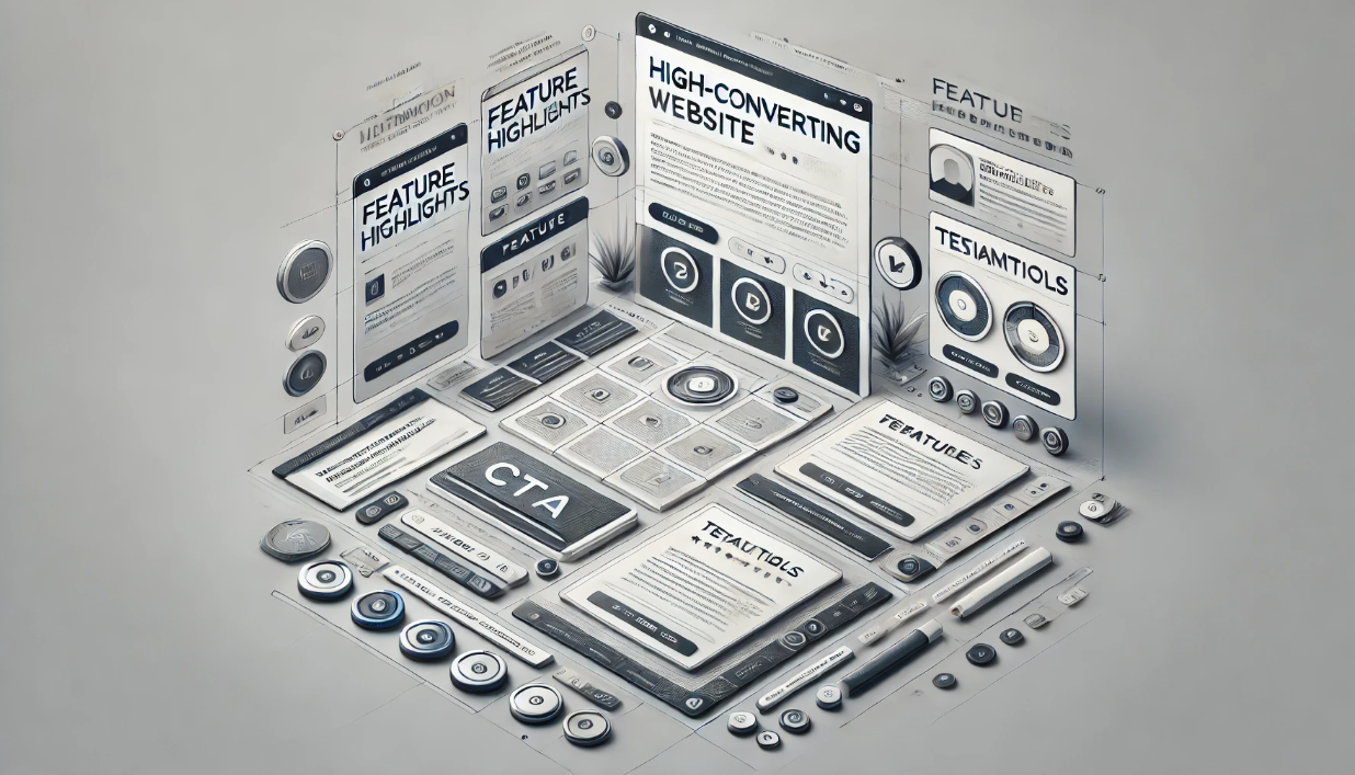
In this guide, we’ll break down best practices for UX/UI design that help you create a high-converting website with a seamless user experience.
1. Why UX/UI Design Matters for Website Conversions
A website that’s visually appealing, easy to navigate, and fast-loading can significantly improve:
✔ User Engagement – Visitors stay longer and explore more.
✔ Conversions – A smooth experience increases sign-ups and purchases.
✔ SEO Ranking – Google rewards sites with great UX and fast speeds.
✔ Brand Trust – Professional design builds credibility.
Did You Know?
88% of users won’t return to a website after a bad experience.
⚡ Websites that load in under 2 seconds see 15% higher conversion rates.
Clear CTAs (Call-to-Actions) increase conversions by 80%.
Tip: A website that’s beautiful but hard to use will lose customers fast.
2. UX/UI Best Practices for a High-Converting Website
✅ 1. Prioritize Speed & Performance
A slow website kills conversions. 53% of visitors leave if a page takes more than 3 seconds to load.
How to Improve Website Speed:
✔ Optimize images using formats like WebP and SVG.
✔ Minimize HTTP requests and use lazy loading for images.
✔ Enable browser caching and compression (Gzip, Brotli).
✔ Use a Content Delivery Network (CDN) to serve assets faster.
✔ Choose fast hosting (avoid cheap shared hosting).
Test Speed: Use Google PageSpeed Insights → pagespeed.web.dev
✅ 2. Use Clear & Engaging CTAs (Call-to-Actions)
Your CTA should stand out and guide users toward signing up, buying, or contacting you.
High-Converting CTA Examples:
✔ “Get Started for Free” (for SaaS websites)
✔ “Claim Your Discount Now” (for eCommerce)
✔ “Download the eBook” (for lead generation)
Best Practices for CTAs:
✔ Make it visible – Use contrasting colors.
✔ Use action words – Avoid generic CTAs like “Submit” or “Click Here”.
✔ Place CTAs strategically – At the top, middle, and bottom of key pages.
✅ 3. Optimize Navigation & Site Structure
A confusing site structure = frustrated visitors who leave.
How to Improve Website Navigation:
✔ Use a sticky menu for quick access.
✔ Keep navigation simple & logical – Avoid clutter.
✔ Add a search bar to help users find content.
✔ Use breadcrumb navigation for eCommerce & blogs.
Test Usability: Use heatmaps & session recordings → hotjar.com
✅ 4. Use High-Quality Visuals & Whitespace
✔ Avoid stocky, generic images – Use custom visuals or real photos.
✔ Keep a balanced layout – Whitespace improves readability.
✔ Use large, legible fonts – 16px+ for body text.
Color Psychology for Conversions:
Blue = Trust & security (best for SaaS & finance).
Red = Urgency & excitement (best for sales & discounts).
Green = Success & growth (best for health & eco-friendly brands).
Tip: A clean, visually appealing design boosts conversions by 30%.
✅ 5. Design for Mobile First
With 60%+ of traffic coming from mobile, responsive design is a must.
Mobile UX Best Practices:
✔ Use flexible grids & scalable fonts.
✔ Ensure buttons are thumb-friendly (44x44px+).
✔ Avoid pop-ups that block content.
✔ Optimize touch gestures for smooth scrolling.
Test Mobile UX: Use Google Mobile-Friendly Test → search.google.com/test/mobile-friendly
✅ 6. Build Trust with Social Proof & Reviews ⭐
Trust signals increase conversions by 40%.
Best Ways to Add Social Proof:
✔ Show customer reviews & testimonials.
✔ Display case studies & success stories.
✔ Use trust badges (e.g., SSL, money-back guarantee).
✔ Add social media proof (followers, shares, and mentions).
Example:
✅ “Join 100,000+ satisfied customers who use our service daily!”
✅ 7. A/B Test Everything to Maximize Conversions
What works for one site may not work for yours. Always A/B test elements like:
✔ CTAs (Red vs. Green buttons).
✔ Headings (“Start Now” vs. “Get Started for Free”).
✔ Page Layouts (1-column vs. 2-column design).
Tools for A/B Testing:
- Google Optimize
- Optimizely
- VWO
Tip: Small tweaks can increase conversions by 10-30%.
3. Common UX/UI Mistakes That Kill Conversions ❌
Avoid these conversion-killing UX/UI mistakes:
❌ Cluttered Design – Too many elements overwhelm users.
❌ Slow Loading Speed – Frustrates visitors and hurts SEO.
❌ Generic CTAs – Doesn’t create urgency or action.
❌ Pop-ups Overload – Annoying pop-ups = high bounce rates.
❌ No Mobile Optimization – Google penalizes non-mobile-friendly sites.
Fix These Issues ASAP to see a boost in engagement and sales.
Final Thoughts: Create a Website That Converts
A high-converting website is all about speed, clarity, trust, and usability.
Quick Recap:
✔ Optimize speed & performance – Fast-loading sites win.
✔ Use clear CTAs – Guide visitors to take action.
✔ Simplify navigation – Make browsing easy.
✔ Make it mobile-friendly – Most traffic comes from mobile.
✔ Use trust signals & social proof – Build credibility.
✔ A/B test key elements – Data-driven changes boost conversions.
Want more conversions? Start implementing these UX/UI best practices today!