How to Optimize Your Website for Mobile Users
Mobile devices have become the primary means of accessing the internet for millions of users worldwide. To ensure your website is user-friendly and performs well on mobile devices, it's crucial to optimize it effectively. This guide will cover essential techniques, examples, and documentation links to help you optimize your website for mobile users.
1. Responsive Web Design
Responsive web design (RWD) is the cornerstone of mobile optimization. It ensures your website adjusts seamlessly to different screen sizes and resolutions.
Implementing Responsive Web Design
Use CSS media queries to create a flexible layout. Media queries allow you to apply different styles depending on the device's characteristics, such as width, height, and orientation.
<!DOCTYPE html>
<html lang="en">
<head>
    <meta charset="UTF-8">
    <meta name="viewport" content="width=device-width, initial-scale=1.0">
    <title>Responsive Web Design</title>
    <style>
        body {
            font-family: Arial, sans-serif;
            line-height: 1.6;
            margin: 0;
            padding: 0;
        }

        .container {
            max-width: 800px;
            margin: auto;
            padding: 20px;
        }

        h1, h2, h3 {
            color: #333;
        }

        pre {
            background-color: #f4f4f4;
            padding: 10px;
            border: 1px solid #ddd;
            overflow-x: auto;
        }

        a {
            color: #0066cc;
        }
    </style>
</head>
<body>
    <div class="container">
        <h1>Responsive Web Design</h1>
        <p>Responsive web design ensures your website adjusts seamlessly to different screen sizes and resolutions. Use CSS media queries to create a flexible layout.</p>
        <pre>
        <style>
        body {
            font-family: Arial, sans-serif;
            line-height: 1.6;
            margin: 0;
            padding: 0;
        }

        .container {
            max-width: 800px;
            margin: auto;
            padding: 20px;
        }

        h1, h2, h3 {
            color: #333;
        }

        pre {
            background-color: #f4f4f4;
            padding: 10px;
            border: 1px solid #ddd;
            overflow-x: auto;
        }

        a {
            color: #0066cc;
        }
        </style>
        </head>
        <body>
        <div class="container">
            <h1>Responsive Web Design</h1>
            <p>Responsive web design ensures your website adjusts seamlessly to different screen sizes and resolutions. Use CSS media queries to create a flexible layout.</p>
        </pre>
    </div>
</body>
</html>
Fluid Grid Layouts
Fluid grid layouts use relative units like percentages instead of fixed units like pixels. This allows your layout to adapt to various screen sizes.
<style>
.container {
    width: 100%;
    max-width: 1200px;
    margin: 0 auto;
}
.col {
    float: left;
    width: 100%;
}
@media (min-width: 600px) {
    .col {
        width: 50%;
    }
}
@media (min-width: 900px) {
    .col {
        width: 33.33%;
    }
}
</style>
Flexible Images and Media
Ensure that images and media scale correctly within their containers by using CSS.
<style>
img, video {
    max-width: 100%;
    height: auto;
}
</style>
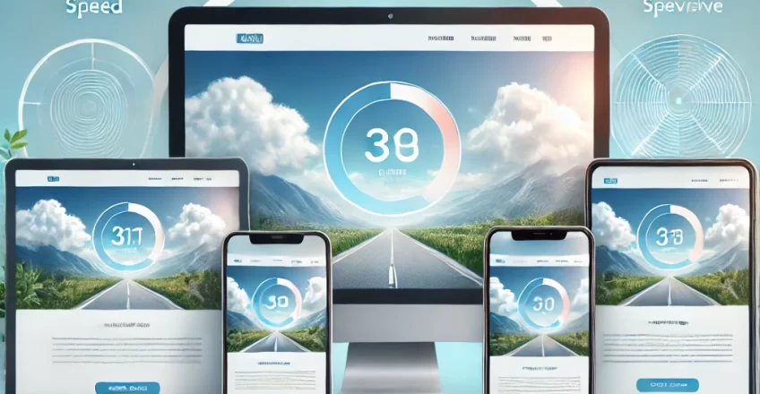
2. Optimize Page Load Speed
Page load speed is critical for mobile users who often have slower internet connections. Here are some ways to optimize load speed:
Minimize HTTP Requests
Reduce the number of HTTP requests by combining files, using CSS sprites, and inlining small CSS and JavaScript files.
Documentation: Minimize HTTP Requests
Use Asynchronous Loading for JavaScript
Load JavaScript files asynchronously to prevent them from blocking the rendering of your page.
<script async src="script.js"></script>
Documentation: JavaScript Start-up Optimization
Optimize Images
Compress images without losing quality, use modern formats like WebP, and implement lazy loading.
<img src="image.jpg" loading="lazy" alt="Example Image">
Documentation: Optimize Your Images
3. Improve Mobile User Experience (UX)
A great mobile UX is essential to keep users engaged and satisfied.
Touch-Friendly Design
Ensure buttons and links are large enough to be tapped easily, with sufficient spacing between them.
<style>
button, a {
    padding: 10px 20px;
    margin: 5px;
    display: inline-block;
}
</style>
Readable Text
Use a base font size of at least 16px and ensure good contrast between text and background.
<style>
body {
    font-size: 16px;
    color: #333;
    background-color: #fff;
}
</style>
Accessible Navigation
Implement a simple and intuitive navigation structure that is easy to use on mobile devices.
<nav>
    <ul>
        <li><a href="/">Home</a></li>
        <li><a href="/about">About</a></li>
        <li><a href="/services">Services</a></li>
        <li><a href="/contact">Contact</a></li>
    </ul>
</nav>
4. Leverage Mobile-Specific Features
Take advantage of features specific to mobile devices to enhance the user experience.
Use Geolocation
Geolocation can provide users with location-based content and services.
<script>
navigator.geolocation.getCurrentPosition(function(position) {
    console.log("Latitude: " + position.coords.latitude);
    console.log("Longitude: " + position.coords.longitude);
});
</script>
Documentation: Geolocation API
Enable Touch Gestures
Enhance interactivity by enabling touch gestures such as swiping and pinch-to-zoom.
Documentation: Touch Events
Utilize Mobile-Friendly Forms
Optimize forms for mobile use by minimizing the number of fields and using appropriate input types.
<form>
    <label for="name">Name:</label>
    <input type="text" id="name" name="name">
    <label for="email">Email:</label>
    <input type="email" id="email" name="email">
    <button type="submit">Submit</button>
</form>
5. Optimize for Search Engines (SEO)
Improving your mobile SEO helps your website rank higher in search engine results.
Mobile-Friendly Test
Use Google's Mobile-Friendly Test to check how easily a visitor can use your page on a mobile device.
Tool: Google Mobile-Friendly Test
Optimize Content for Mobile Search
Ensure your content is concise, relevant, and uses keywords effectively for mobile search.
Documentation: Mobile SEO Overview
Implement AMP (Accelerated Mobile Pages)
AMP provides a framework for creating fast-loading mobile pages.
<html amp>
<head>
    <script async src="https://cdn.ampproject.org/v0.js"></script>
    <link rel="canonical" href="/example.html">
    <style amp-boilerplate>
        body {
            -webkit-animation: -amp-start 8s steps(1,end) 0s 1 normal both;
            -moz-animation: -amp-start 8s steps(1,end) 0s 1 normal both;
            -ms-animation: -amp-start 8s steps(1,end) 0s 1 normal both;
            animation: -amp-start 8s steps(1,end) 0s 1 normal both;
        }
        @-webkit-keyframes -amp-start {
            from { visibility: hidden; }
            to { visibility: visible; }
        }
        @-moz-keyframes -amp-start {
            from { visibility: hidden; }
            to { visibility: visible; }
        }
        @-ms-keyframes -amp-start {
            from { visibility: hidden; }
            to { visibility: visible; }
        }
        @keyframes -amp-start {
            from { visibility: hidden; }
            to { visibility: visible; }
        }
    </style>
    <noscript><style amp-boilerplate>
        body {
            -webkit-animation: none;
            -moz-animation: none;
            -ms-animation: none;
            animation: none;
        }
    </style></noscript>
</head>
<body>
    <h1>Hello, AMP!</h1>
</body>
</html>
Documentation: Getting Started with AMP
6. Monitor and Test Your Website
Regularly monitor and test your website to ensure it remains optimized for mobile users.
Use Analytics Tools
Implement tools like Google Analytics to track mobile user behavior and identify areas for improvement.
Documentation: Google Analytics for Mobile Apps
Conduct Usability Testing
Perform usability testing with real users to gather feedback and make necessary adjustments.
Documentation: Usability Testing
Use Performance Monitoring Tools
Tools like Lighthouse and PageSpeed Insights help you monitor and improve your website's performance.
Documentation: Lighthouse
Documentation: PageSpeed Insights